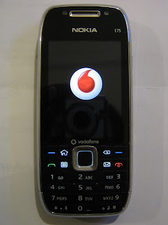
Thanks again to @aussienick, I have another shiney toy in my hands - the Nokia E75. Half candybar, half QWERTY slider, this phone straddles the boundary between feature and smartphone, and while having some a pretty capable multimedia features as well.
Having just played with the phone for a few hours, here are a few things that I've noticed:

Front on, you might mistake the E75 as another run-of-the-mill freebie Nokia phone
The Good:
-The E75 can be charged by USB (I think it may be one of the first Nokia phones to have that ability)
-It uses a standard 3.5mm headphone jack for sound output
-The camera is very good, with auto-focus, accurate colours, and proper compensation for when the flash is used (ie it throttles down so that the light from the flash doesn't wash out the image)
-It takes video in 640x480 at a high frame rate (30fps?) - the video is saved in .mp4 format.
-The fit and finish of the device overall is very high - the back of the device looks a million dollars - and the sliding mechanism is nice and precise
-The screen is bright and crisp.
-The QWERTY keyboard is spacious, and the materials for the keys look and feel high-grade and durable
The Bad:
-Although charging is via usb, the port in the phone is proprietary, so you have to use Nokia cables (no microusb here unfortunately)
-The battery capacity is quite small - only 2/3rds the capacity of the E71 - I will test this more tomorrow to see how the battery copes with heavy use.
-The QWERTY keyboard lacks arrow keys (you're only method of navigating on the non-touchscreen phone) - so to enter text and navigate the screen, your right hand has to move back and forth from the QWERTY and the direction pad at the candybar face of the phone - you also do the same for the left and right shortcut keys.
-The phone automatically locks the keypad when you close the slider, which makes it annoying if you want to quickly switch from QWERTY to keypad/direction pad use in portrait mode (amendment: You can turn this off), as I often do when I want to switch from two-handed to one-handed use.
-Whilst the two halves of the slider are pretty solid when closed, when the QWERTY keyboard is slide out, the screen half of the phone does have a bit of wobble, and its the time when the phone feels the most fragile.
The Ugly:
-The front looks and feels like a cheap throw-away nokia - the thin bands of cheap feeling plastic that make up the number keys are ricketty, really close together, and the bottom left and right keys are very hard to press. They feel so fragile and such an afterthough, that Nokia maybe have done better without them, and just extended the length of the screen.
Keys made out of thin, flimsy plastic ruins the otherwise stylish E75
I think there is so much to love about this phone, but even just after a few hours of use, I can see there are a few hardware and functionality choices that may make it hard to live with this phone. Anyhoo, I'll keep an open mind, and report my findings while I have the phone.
I've posted some more images of the phone below, and I'll do a few phone camera tests later in the week.

Note the brighter screen of the E75 (versus the Dopod 838), and the classier look and feel of the device with the slider open

The smaller capacity battery on the E75 (left, versus the E71) may be a limitation and potential dealbreaker for business users
The E75 (bottom) is shorter, but thicker than the E71


No comments:
Post a Comment