So I've just just recently purchased an android tablet (The Asus Transformer Pad TF300), and after playing with it for a few weeks, I have to say that I'm quite impressed. With 4.0 Ice-cream sandwich, I can see the hard work that Google devs have put into giving android a distinctive and unified look. Unfortunately, despite the improvement in the UI of the operating system, I feel that some of the apps in the Google Play store are letting the team down by having dubious design choices, which takes the shine off the slick 4.0 (ice-cream sandwich) look and feel.
So rather than describe them, I thought I'd provide some screenshots of the apps that I've downloaded so far compared to their iOS counterparts, and hopefully you can see what I mean.
Example 1: Twitter
Android
I don't know what the deal is with the twitter app on android, but it seems like they have made no effort at all to adapt it to the Tablet format. What this means is that each "tweet" is stretched over the scan of the screen, which is ok, but is a bit 'meh'.
iPad
In comparison, the iOS app has two distinct interfaces for the iPhone/iPod Touch and another for the iPad. Having the current feed on a narrower column allows space for viewing any linked content simultaneously - whether or not this adds to the experience depends on the individual (I think it does), but it certainly gives the feeling that the iOS developers gave the app a bit more thought.
Example 2: Buzzfeed
Android
While it does show that the BuzzFeed Android devs thought about the interface in the context of a Tablet screen, the execution is a little rough around the edges. The vibe I got was a mix of Windows CE, iOS/webOS and not much android at all...The icons on the left are a bit low rez, and the overuse of stark white with the rigid rectangular cells for the feed contents, to the harsh dark blue 'highlighting' of the selected post is a bit of a mess.
iPad
In contrast, the iPad app is a bit more polished (though not perfect eg the icons are still a bit low rez, and there is no way to go back when you've accidentally clicked on an image), but it just seems to handle fitting the different elements (the subject icons, the feed list and the current content being viewed) much more elegantly. Note as well that when a specific post is highlighted, the font colour of the heading changes from Blue to white, therefore giving a better contrast when it gets highlighted in blue.
Ok, so two apps does not a convincing argument make, and I've found that there are at least two (so far, I haven't finished looking) non-game apps that are quite polished:
Example 3: IMDb
Android
The image speaks for itself: the background is a dark grey, which makes the cover art and other images pop; there is enough space between the different elements as to strike a good balance between use of the space without being cluttered. Really well done.
iPad
The iPad app looks good too, but has a much lighter background which does take away some of the impact of the cover art, but not much. In this case I actually prefer the android version, because it seems less cluttered.
Example 4: Marvel
Android
This app is a bit border-line for me, because at first glance, this looks like a good app. But once you take a closer look, especially having used the iPad version a bit more (bias, I know) you notice some issues, most notably that viewing the app in landscape mode cuts off the lower half of the titles on display on the bottom of the screen. You could make a case that it is a symptom of the 16:9 aspect ratio on the Android tablets, but knowing that limitation, you would have thought they could made a bit more space for those first row of covers. There also seems to be a lot of wasted space around the banners (I think they were arranged to fit the iPad). I also don't like how some of the options are hidden in a drop down menu.
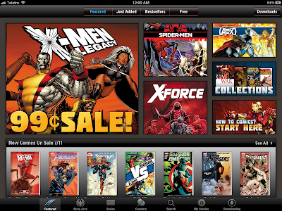
iPad

Note how all the options are available on the top and bottom borders, and how all the banners and comic book covers make use of all the available space.
Once you're viewing a comic though, the experiences are pretty identical, except for the unused space on the left and right hand side of the android version:
Android
iPad
What do you think? Are there any other android apps that you can think of that showcase the potential of the platform, or have any insights on how easy/hard it is to make a good looking app on Android vs iOS?
I'll also build on this post as I gain more experience with my android tablet, as well as eventually posting a review of the tablet itself.
P.S. This entire blog post was almost completely written on the TF300 with the help of the optional keyboard dock! I did however use a 'proper' laptop for adding some of the pictures and final formatting (just because that is a task best performed on something with a bigger screen)


No comments:
Post a Comment